The Red Line vs. The Green Line: How Data Visualization Exposed the Gap in Mathematics
Data visualization transformed Makindye Ssabagabo’s education system by revealing subject performance gaps, streamlining UNEB analysis, and enabling timely, evidence-based decisions that improve school planning, resource allocation, and learner outcomes overall.
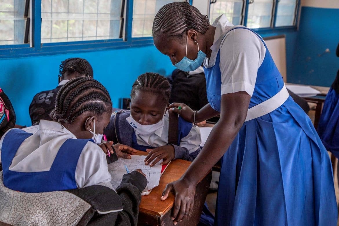
For years, the Education Department of Makindye Ssabagabo Municipal Council struggled with inefficient, manual data management processes. Relying on physical inspections and self-reported figures meant that important strategies were often built on incomplete, delayed or error-prone information.
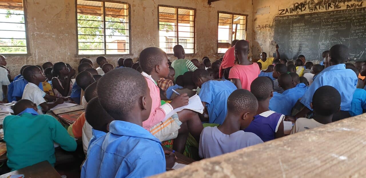
The bottleneck tightened whenever learner exam results from the Uganda National Examination Board (UNEB) arrived in PDF format, forcing staff to lose days manually extracting and typing data into Excel. This tedious work left no room for timely analysis. Spotting trends such as top-performing schools, subject-specific gaps or gender disparities felt nearly impossible.
The introduction of DHIS2 at the municipal level, supported by the HISP Uganda team, has fundamentally transformed this workflow. What once took weeks can now be accomplished in a day, thanks to real-time data analysis, which enables faster, evidence-based decisions. Tasks like identifying the municipality’s best-performing school, analyzing subject-specific pass rates, and comparing performance by sex are now seamless. A striking example of this efficiency is this year’s UNEB analysis, where district dashboard visualizations revealed Social Studies (SST) as the top-performing subject, while Mathematics lagged behind – all clearly displayed through instant, system-generated line graphs; revealing insights that were previously buried in static PDFs.
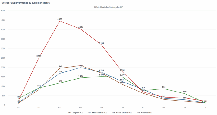
As illustrated in the graph above, the performance gap is undeniable. This sharp peak of the red line represents the high success rates in Social Studies, while the green line reveals a significantly flatter performance in Mathematics. This clear visual evidence prompted an immediate deep dive into our UPE schools to understand why the numbers were so low.
The investigation uncovered that struggling schools like Kigo Prisons and Busabala Primary Schools were hampered by understaffing, teacher complacency and a lack of geometry sets. In response the department initiated a restructuring; recruiting new staff, rotating strong teachers into struggling schools and distributing math tools. To further support struggling schools, some strong teachers from high-performing schools were strategically transferred to underperforming ones to help boost overall academic achievement.
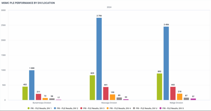
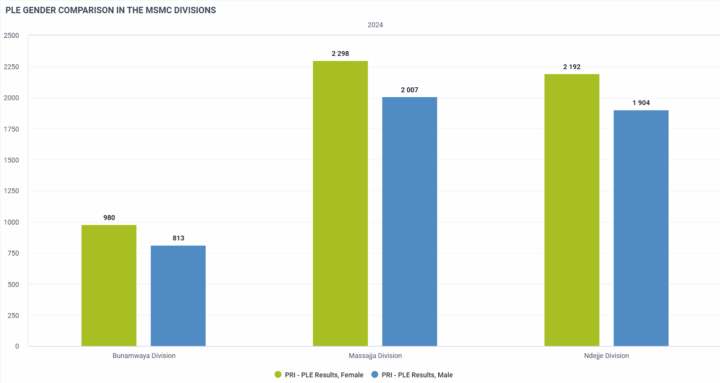
Previously, local analysis was limited because the UNEB portal could not disaggregate results by division. We could see the municipality’s score, but not the specific performance of Ndejje, Masajja, and Bunamwaya. However, with the integration of DHIS2’s data visualizer, the Education Department was able to filter data geographically. We can now compare academic outcomes and gender disparities across divisions instantly. The allows us to target resources where they are needed most, rather than applying a blanket solution. The visualizations below highlight these differences, identifying top-performing divisions and highlighting gaps in gender equity.
The potential of the district-DHIS2 extends beyond the analysis of exam results. The system is steadily evolving into a comprehensive database for the entire municipality, solving the critical challenge of tracking school enrollment. As implementation expands, users will gain instant access to vital statistics, from teacher-pupil ratios to classroom availability, across both public and private institutions.
This inclusivity is critical in Uganda, where the private sector is massive. With private institutions accounting for nearly 60% of secondary enrollment and roughly 40% of primary schools nationally, previously planning methods that relied solely on government data left the department blind to a huge portion of the student body.
Historically, data was skewed toward Universal Primary Education (UPE) schools, with limited information from private institutions, resulting in biased reporting and incomplete planning. Today, we’re closing that gap by capturing data from every registered school within the municipality. What used to require months of manual inspections, is now gathered via simple booklets and instantly digitized. This has dramatically improved the department’s ability to identify teacher shortages or the need for additional classrooms, and to make informed, timely decisions about resource allocation and program planning.
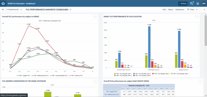
Perhaps the most visible change is during review meetings. We have replaced bulky paper reports with customizable dashboards that visualize key indicators needed in real-time. This supports School Management Committee conversations and Municipal Education reviews, replacing arguments over data quality with productive conversations about solutions.
A notable example is the custom PLE Performance Dashboard, shown below. It was developed specifically to display division-specific results and trends for stakeholder review, setting a new standard for transparency in the municipality.
Our focus now shifts to full implementation, ensuring every school contributes to and benefits from this district database. With the technical support of HISP Uganda and the DHIS2 community, we are moving away from ad-hoc reporting toward a sustainable, standardized system that puts student performance at the centre of municipal planning.
About the Author:
Kitumba Mark Demotricius is an Information and Communication Technology (ICT) specialist currently serving as a Data and IT Support Officer at Makindye Ssabagabo Municipality. He works closely with HISP Uganda as a DEMIS Support Officer, data entrant, and trainer. With a strong background in ICT. Mark actively supports data-driven innovations across the education sector and beyond.